
Advertising has long been a powerful tool for shaping consumer behavior and perceptions. Some ads emphasize brand identity, like Volkswagen’s “2 Shapes Known the World Over” campaign, which cleverly linked the iconic VW Beetle with the universally recognized Coca-Cola bottle. Others, like Ford’s “Gold Rush” newspaper ad, were designed to directly impact workforce recruitment, offering $5 a day to attract laborers to Detroit’s growing automobile industry. Carulla Knives took a more visual approach, using artistic print ads to demonstrate the superior slicing quality of its premium cutlery. Volvo’s “We Design Every Volvo to Look Like This” focused on safety, showcasing how the car’s design protected passengers in a crash. Meanwhile, the Wate-On ad took a now-unconventional approach to body image, promoting weight gain as a means of achieving an attractive figure, which is a stark contrast to the weight-loss messaging seen in advertising today. Though vastly different in their goals and messaging, these ads exemplify the persuasive power of advertising across different industries and time periods.
2 Shapes Known The World Over (1962)
Some advertisements are instantly memorable, not because they overwhelm with information, but because they say so much with so little. Volkswagen’s 1962 ad “2 Shapes Known the World Over” is a perfect example of how simplicity can be incredibly effective in branding.
This minimalist print ad from the 1962 Reader’s Digest features just two silhouettes: the iconic shape of a Volkswagen Beetle and the unmistakable contour of a Coca-Cola bottle. There is no lengthy tagline, no excessive branding, just two globally recognized forms side by side, with the phrase “2 Shapes Known the World Over.”

The ad was designed to reinforce Volkswagen’s status as an instantly recognizable global brand and highlighted the power of simplicity and timeless design, showing that the Beetle’s enduring presence in popular culture was as natural and familiar as reaching for a bottle of Coke. Rather than making a hard sell, Volkswagen allowed the imagery to speak for itself, subtly reminding consumers that the Beetle was as much a staple of everyday life as one of the most famous beverages in the world.
Volkswagen’s target market was broad and reached people across different demographics and cultures. The ad appealed to consumers who valued reliability and familiarity, as well as younger buyers looking for a well-known car. The Beetle had already gained a reputation for its practicality and efficiency in Germany and the automaker was trying to break into the US auto market (fahr(T)raum, 2023). By collaborating with a well known brand, Coca-Cola, this ad cemented the VW Beetle’s place as a car recognized worldwide (fahr(T)raum, 2023).
Instead of using a direct call to action, this ad functioned as a brand reinforcement. It suggested that if people recognized and trusted the Coca-Cola bottle, they should feel the same about the Volkswagen Beetle. By tapping into people’s emotional connection with Coca-Cola, a brand synonymous with comfort, trust, and consistency, Volkswagen positioned itself as a car brand with the same qualities. The message was clear: no matter where you go, people know and love the Beetle, just like they do with Coca-Cola. The effectiveness of this ad could be measured by brand recognition surveys and consumer recall tests, as it relied on the instant familiarity of both the VW Beetle and Coca-Cola bottle to reinforce brand identity.
The value proposition of this ad was simple yet effective. Like Coca-Cola, Volkswagen was presenting itself as a timeless, universally known brand. The Beetle’s instantly recognizable design, the brand’s trustworthiness, and its deep cultural connection all came together in a single, powerful image. Owning a Beetle wasn’t just about transportation; it was about being part of something iconic.
The effectiveness of this ad could be measured by brand recognition and increased sales post-ad.
I love the simplicity of this ad and how it proves that a great product doesn’t need an elaborate pitch to make an impact.
Volkswagen’s “2 Shapes Known the World Over” is a masterpiece in minimalist advertising. By comparing the Beetle to Coca-Cola, Volkswagen solidified its place in the cultural landscape as a brand that people knew and trusted. The ad didn’t just sell a car; it sold an idea that some things are so well-designed that they become part of the fabric of everyday life.
References
Adbranch. (2011, Feb 1). 2 Shapes Known The World Over. Retrieved from Adbranch: Evolution of the Advertising Industry: https://www.adbranch.com/2-shapes-known-the-world-over/
fahr(T)raum. (2023, Aug 17). The advertising history of the VW Beetle. Retrieved from fahr(T)raum: https://www.fahrtraum.at/en/the-advertising-history-of-the-vw-beetle/
Ford’s “Gold Rush” (January 7, 1914)
In 1914, Henry Ford shook the industrial world with a simple yet groundbreaking newspaper advertisement that offered workers an unprecedented wage of $5 per day to work in his Detroit factory. This bold move, often referred to as the “$5 Workday,” wasn’t just a job listing, it was a strategic shift that transformed labor, manufacturing, and the American economy (Ford, n.d.).
The ad itself resembled a gold rush call to action, enticing workers with an offer they couldn’t ignore. At a time when most factory workers earned $2 per day, Ford’s wage increase more than doubled the standard pay (Ford, n.d.). Thousands of job seekers, flooded to Detroit to claim their share of this opportunity. The ad’s straightforward yet compelling messaging sparked a mass migration, illustrating the power of advertising in not just selling a product, but shaping an industry.
This campaign had clear objectives beyond just hiring workers. Ford recognized that higher wages meant a more stable, productive workforce. The strategy also had a broader economic goal: by paying workers more, Ford was enabling them to afford the very automobiles they were producing (The Henry Ford, 2014). The concept of a well-paid working class fueling consumer demand became the foundation of modern industrial capitalism.
The target market for this ad was vast, appealing to immigrants, skilled and unskilled laborers, and working-class Americans looking for better economic opportunities. By offering wages far above industry standards, Ford attracted the best talent and created a loyal workforce.
Unlike traditional advertisements that promote products, this ad promoted a way of life and the idea that industrial work could lead to prosperity. Ford’s decision to invest in his workers’ well-being wasn’t just about filling job openings; it was about creating a sustainable labor model that benefited both employees and the company. This was an early form of employer branding, where a company markets itself as a great place to work rather than just focusing on selling products.

The value proposition of this ad was clear: work for Ford and earn more than anywhere else. It offered financial security and an opportunity for a better life, positioning Ford as a company that cared about its workers. This approach not only improved employee morale and productivity but also revolutionized industrial labor standards worldwide. The success of this ad was measurable through the increase in job applications and worker retention rates, as Ford’s offer of $5 per day led to a surge in labor supply and ultimately improved productivity in his Detroit factories.
This ad holds personal significance for me because my father’s side of the family, the Ferrys, came to Detroit from Czechoslovakia to work on Ford’s assembly line. Like many other immigrants, they were drawn by the promise of a better future and the opportunity to earn a livable wage. Ford’s decision to increase salaries not only changed the auto industry but also shaped the lives of thousands of families, including mine, by giving them stability and a path to the American Dream. The Ferry family still resides in Detroit, and my grandfather was the last Ferry male to work for the automaker. The legacy of Ford’s historic wage increase lives on, not just in the auto industry but in the generations of families that it uplifted.
Ford’s “Gold Rush” newspaper ad was more than just a job posting, it was a turning point in American industry. By doubling the standard wage, Ford set a new precedent for labor standards and consumer economics. The ad’s influence extended far beyond its initial purpose and shaped modern business practices, proving that sometimes, the most successful strategies are the ones that prioritize people over profits.
References
Ford. (n.d.). The Moving Assembly Line and the Five-Dollar Workday. Retrieved from Ford: https://corporate.ford.com/articles/history/moving-assembly-line.html
The Henry Ford. (2014, Jan 3). Ford’s Five-Dollar Day. Retrieved from The Henry Ford: https://www.thehenryford.org/explore/blog/fords-five-dollar-day/
Carulla Knives (2010)
Carulla, a high-end supermarket chain, sought to change customer perceptions about cutlery with its visually striking print advertisement campaign. The issue they faced was that consumers didn’t see the value in paying extra for fine-cut knives because all knives do the same thing (The People’s Graphic Archive, 2024). To bridge this gap, Carulla created an ad that not only showcased the precision of their knives but also made customers experience the difference visually.
The brilliance of this campaign lies in its simple yet powerful execution. The ad features fish and vegetables placed underneath printed columns, where each column appears to act as a slice made by the Carulla knives. This clever design visually demonstrates how clean and precise the cuts are, which immediately conveys the product’s superior quality. Unlike a traditional ad that might show a knife in action, this approach turns the print medium itself into a demonstration, allowing the viewer to see the difference instantly.
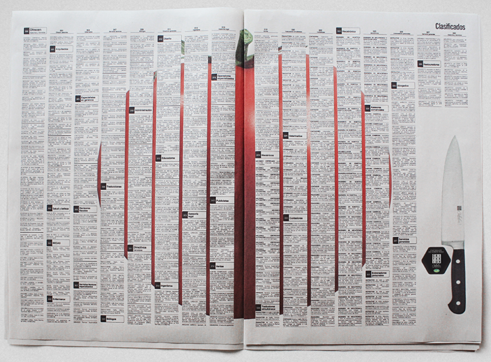

This campaign effectively transforms an abstract idea, like cutting precision, into a visual experience. It plays on the contrast between an ordinary knife and a fine-cut one without using excessive text or explanations. Using minimalism and a clever design, the ad delivers a clear message that appeals to Carulla’s target audience: high-profile customers who appreciate quality and precision.
The value proposition here is evident: Carulla isn’t just selling a knife, it’s selling a superior cutting experience. This ad successfully shifts consumer perception, reinforcing that a fine-cut knife isn’t just a tool but an investment in precision and elegance. The impact of this campaign could be measured by tracking sales data before and after the ad launch, as well as consumer willingness to pay a premium for high-quality knives instead of generic alternatives.
Carulla’s print campaign demonstrates how strategic design and creativity can make a product stand out in a market where consumers often overlook quality for price. By showing rather than telling, the ad brilliantly conveys the superiority of Carulla’s cutlery, making a strong case for why paying extra for precision is worth it.
References
Ogilvy & Mather. (n.d.). Carulla Knives. Retrieved from Behance: https://www.behance.net/gallery/509295/CARULLA-Knives
The People’s Graphic Design Archive. (2024, Nov 22). Carulla Knives Advertisement. Retrieved from The People’s Graphic Design Archive: https://peoplesgdarchive.org/item/16025/carulla-knives-advertisement
Volvo

Volvo has long been known for its dedication to safety innovation, and its ad “We Design Every Volvo to Look Like This” reinforces that reputation with a powerful visual message. The advertisement features a Volvo that has been in a car accident, but unlike typical accident imagery that shows destruction, this image is calculated and intentional. The front and rear of the car are crumpled, yet the cab remains completely intact, showing that Volvo prioritizes the protection of its passengers above all else.
This ad succeeds in conveying Volvo’s core value of safety without excessive text or complex explanations. The visual alone tells the entire story: crashes happen, but in a Volvo, the people inside have the best possible chance of walking away unharmed. The deliberate design of crumple zones that absorb impact while keeping the passenger compartment intact is a testament to Volvo’s engineering expertise.
Unlike many car advertisements that focus on performance, luxury, or technology, this campaign takes a direct stance on safety. By showing a realistic crash scenario, Volvo doesn’t just promise safety, it proves it. This approach instills confidence in potential buyers, particularly those prioritizing family and personal security. If Volvo car sales increased, the ad was successful.
The value proposition in this ad is clear: Volvo vehicles are designed with life in mind. It shifts the focus away from superficial aesthetics or high-speed performance and instead emphasizes what truly matters, which is protecting the people inside. In a market where safety ratings influence purchasing decisions, this campaign effectively differentiates Volvo from its competitors by turning vehicle durability into an emotional and practical selling point.
The effectiveness of this safety-focused ad could be measured through crash test ratings, consumer trust surveys, and an increase in vehicle sales, particularly among safety-conscious buyers looking for a reliable family car.
By leveraging minimalism, strong visuals, and a clear message, Volvo’s ad reinforces its status as a leader in automotive safety. It reassures consumers that when they choose a Volvo, they are choosing a car designed to save lives.
References
Wylie, N. (2025, Jan 27). Lessons from the 16 best print ads of all time. Retrieved from Filestage: https://filestage.io/blog/best-print-ads/
Super wate-on

This Wate-On advertisement, with its bold headline “Wouldn’t You Have More Fun if You Weren’t So Skinny?”, is a fascinating glimpse into how beauty standards have evolved over time. This vintage ad promotes a weight-gain supplement, targeting those who were considered too thin, and suggests that having a fuller figure equates to being happier and more attractive. The messaging is clear: being skinny isn’t fun, and if you want to enjoy life and feel beautiful, you need to gain weight.
The advertisement is effective because it plays on emotional appeal and societal expectations. The imagery features smiling, confident women in swimsuits, promoting the idea that a “curvier” body is the key to happiness, desirability, and a better social life. By associating weight gain with attractiveness and fun, the ad subtly pressures its audience into believing that being thin is holding them back from fully enjoying life.
What makes this ad particularly interesting is how drastically beauty ideals have shifted in modern advertising. Today, the majority of ads promote weight loss rather than weight gain, and the media often portrays ultra-thin or highly sculpted figures as ideal for both men and women. From diet pills and injections to fitness programs, today’s advertising landscape sends the opposite message: that being thin is the key to happiness and confidence.
This contrast highlights how cultural and societal norms influence consumer perception. In the era of Wate-On, fuller figures were desirable, while today, the focus is on achieving a lean, toned, or even unrealistic body shape. Both approaches capitalize on insecurities, shaping the way people feel about their bodies in order to sell a product.
From a measurability standpoint, the success of this ad would have been determined by sales figures, consumer testimonials, and market demand. If more people purchased Wate-On after seeing the ad, it demonstrated effective persuasion.
While the beauty industry continues to evolve, this vintage ad serves as a reminder that beauty standards are not fixed. Beauty standards are socially constructed and ever-changing. Whether promoting weight gain or weight loss, advertisements have long influenced how people see themselves and what they believe they need to do to be accepted, confident, and happy.
References
Vintage Everyday. (2019, Sept 11). Vintage Wate-On Ads That Promise to Help ‘Skinny’ Girls Put on Pounds. Retrieved from Vintage Everyday: https://www.vintag.es/2019/09/vintage-wate-on-ads.html
From selling products to shaping societal norms, these advertisements highlight the evolving nature of marketing strategies. Whether it was Volkswagen reinforcing brand recognition, Ford revolutionizing labor recruitment, Carulla Knives elevating premium products, Volvo prioritizing safety, or Wate-On addressing body image perceptions, each ad was carefully crafted to leave a lasting impression. Their success can be measured through consumer recall, sales impact, and shifts in public perception, proving that effective advertising extends beyond a single campaign. Advertising can be used to influence industries, consumer habits, and cultural attitudes for years to come.

Leave a reply to Freddy Colindres Cancel reply