
Decathlon “Outage”
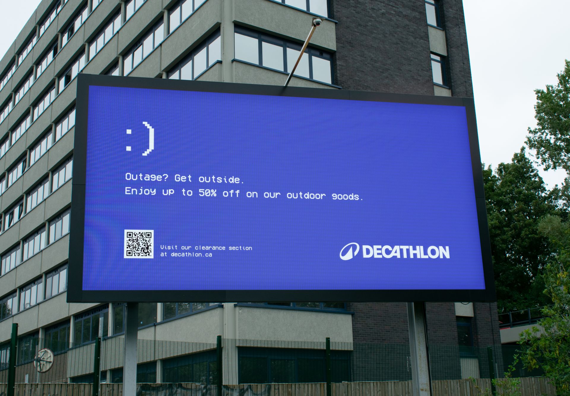
Decathlon’s “Outage” ad is a brilliant example of timely, clever marketing that capitalizes on a shared cultural moment. By mimicking Microsoft’s notorious “blue screen of death,” the ad immediately grabs attention through humor and relatability, especially for those who have experienced the frustrations of a tech failure. Instead of offering a digital solution, Decathlon flips the script entirely, using the outage as an opportunity to reinforce its core brand message: encouraging people to disconnect and enjoy the outdoors (Caticchio, 2024). The simple but effective line, “Outage? Get outside,” serves both as a playful jab at tech dependence and as a seamless call to action aligned with Decathlon’s mission.
Visually, the ad goes beyond just messaging as it features a bold offer of up to 50% off outdoor goods, paired with a QR code that directs users straight to the Decathlon website. This not only reinforces the incentive to take action but also provides an easy way to engage with the brand in the moment, especially as consumers are already primed for distraction during an outage. However, I enjoy playing the dinosaur game when the internet is down.
The value proposition here lies in reminding consumers that their best moments don’t have to be tethered to a screen; they can be found in nature, in movement, and in exploration. It positions Decathlon as more than just a retailer of sports and outdoor gear; it’s a brand that advocates for a more active, connected lifestyle.
Though the ad is short and rooted in humor, its impact is measurable through traffic to the linked website via the QR code, sales conversions during the promotion, and engagement on social media. Its success doesn’t depend on a hard sell but on cultural relevance, emotional resonance, and smart integration of a call to action that shows us that sometimes the most effective ads are the ones that meet people right where they are and then invite them to step outside.
References
Caticchio, K. (2024, Dec 17). Our 25 Favourite OOH and Billboard Ads of 2024. Retrieved from Broadsign: https://broadsign.com/blog/our-favourite-ooh-and-billboard-ads/
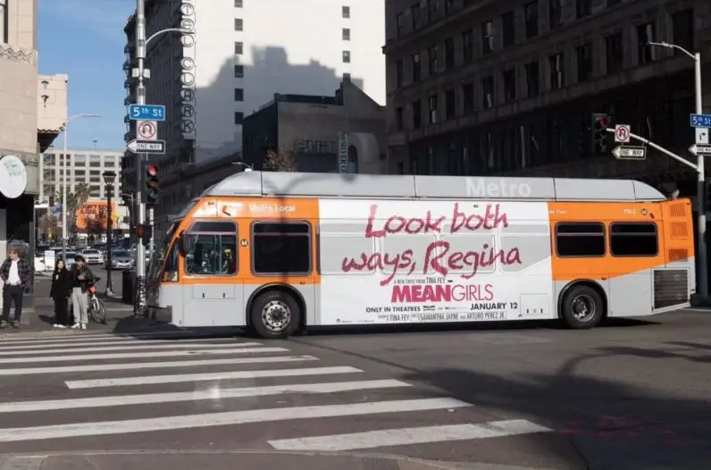
MEANGIRLS
The “Look Both Ways, Regina” bus wrap promoting the Mean Girls musical is a standout example of clever, context-driven outdoor advertising. By referencing one of the film’s most memorable scenes, where Regina George is hit by a bus, the campaign instantly taps into audience nostalgia and pop culture familiarity. The slogan, scrawled in bright pink lipstick, doesn’t just catch the eye; it allows you to hear the Mean Girls’ attitude and instantly demonstrates the campaign’s tone and target audience. It’s a perfect blend of sass and strategy.
Strategically, the campaign shines in a city like Los Angeles, where long commutes, pedestrian foot traffic, and frequent traffic jams turn buses into moving billboards. These mobile ads ensure high visibility across various demographics, including young fans of the original film, newcomers drawn to the musical, and casual observers who might catch a glimpse and head online to learn more. The wrap’s design is both playful and on-brand, proving that a few well-chosen words and iconic visuals can deliver serious impact.
The use of lipstick as a design element is especially smart as it is a visual representation of the Mean Girls aesthetic and a nod to the film’s signature femininity and boldness. That attention to detail, combined with strategic placement and viral potential, turned what could’ve been a basic promo into a conversation piece. On social media, photos of the buses quickly circulated, spreading awareness far beyond just LA commuters and reinforcing the show’s cultural relevance (Caticchio, 2024).
The success of this campaign can be measured through increased ticket sales in regional markets, social media engagement metrics (shares, likes, mentions), and boosted interest in the touring production. It also demonstrates how leveraging iconic moments from a beloved movie can reignite interest and bring a classic into the spotlight for a new generation.
References
Caticchio, K. (2024, Dec 17). Our 25 Favourite OOH and Billboard Ads of 2024. Retrieved from Broadsign: https://broadsign.com/blog/our-favourite-ooh-and-billboard-ads/
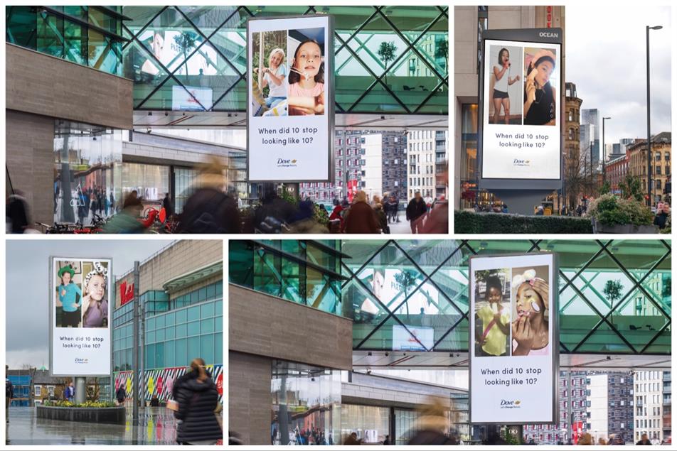
When did 10 stop looking like 10?
Dove’s “When Did 10 Stop Looking Like 10?” campaign is a powerful and provocative commentary on the increasingly blurred lines between childhood and adulthood in the age of beauty consumerism. Through a side-by-side visual comparison, the campaign shows a stark contrast: on the left, joyful, carefree ten-year-old girls are engaged in innocent activities—singing karaoke, riding carousels, and playing dress-up. On the right, girls the same age are seen applying anti-aging skincare products, engaging in routines that are clearly marketed for adult women.
The imagery is simple but impactful. It forces viewers to confront an uncomfortable truth: societal pressures are pushing children—particularly young girls—into adult beauty standards far too early. The question posed beneath the images, “Why did 10 stop looking like this?”, serves as both a call to action and a moment of reflection for parents, marketers, and culture at large.
The campaign is clearly aimed at adults, especially parents, caregivers, and decision-makers in the beauty and advertising industries. It seeks to spark concern and awareness among those who influence what young girls see, buy, and believe about themselves. It also resonates with women who remember their own childhoods and now face the responsibility of raising girls in an image-saturated world.
Dove positions itself not just as a skincare brand, but as a champion for real beauty and self-esteem. By calling out harmful industry trends, Dove reinforces its long-standing commitment to authenticity and mental well-being. The value proposition here isn’t about selling a specific product—it’s about selling trust. Dove wants to be seen as the ethical choice in a sea of unrealistic beauty expectations.
While this campaign lives primarily in print and out-of-home formats, its success can be measured through:
- Earned media coverage and discussions it sparks in news and opinion outlets.
- Engagement metrics online, especially as the images are shared across social platforms.
- Brand sentiment tracking over time, especially among parents and socially-conscious consumers.
- Traffic to Dove’s self-esteem resources, which often accompany such purpose-driven campaigns via a QR code.
Ultimately, “When Did 10 Stop Looking Like 10?” is a reminder of how advertising can go beyond selling and start shaping culture. It’s a bold message wrapped in a soft aesthetic that is true to Dove’s brand yet deeply disruptive in the best way.
References
Lewis, S. (2024, April 8). Dove and Ogilvy highlight impact of anti-ageing skincare trend on 10-year-old girls. Retrieved from Campaign: https://www.campaignlive.co.uk/article/dove-ogilvy-highlight-impact-anti-ageing-skincare-trend-10-year-old-girls/1867825
Live on ny
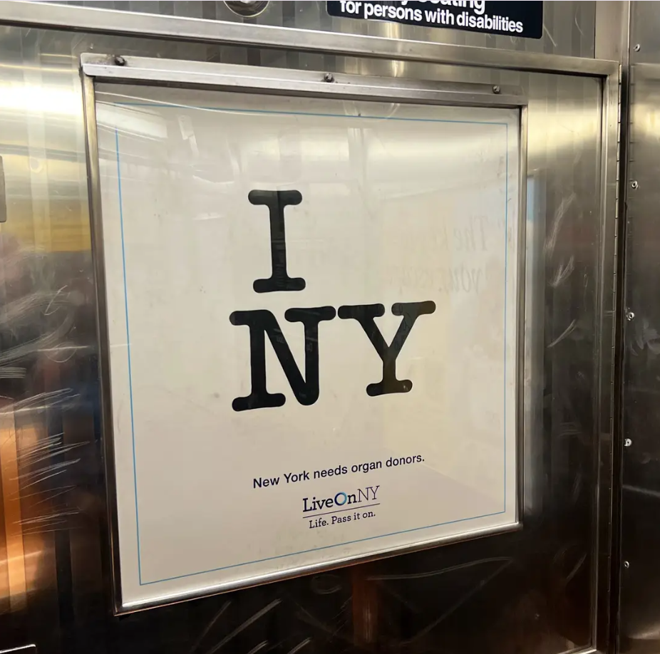
The LiveOn NY ad makes a bold and emotionally resonant statement by reimagining one of the most recognizable symbols of New York, the iconic “I ❤️ NY” logo. In this campaign, the heart is completely removed, leaving behind a stark and jarring visual that simply reads: “I NY.” Below, the message appears: “New York needs organ donors.”
This ad is minimalist in nature and by subtracting the heart, LiveOn NY not only catches the viewer’s attention but also creates an immediate sense of loss both visually and emotionally. The missing heart is not just a design tweak; it’s a metaphor for those waiting for organ transplants, many of whom require a literal heart. The simplicity of the layout allows the gravity of the message to land hard and linger.
The campaign targets all New Yorkers, especially adults eligible to register as organ donors. It’s designed to resonate with everyday citizens by connecting personal identity with civic responsibility. By using a universally beloved logo, the ad speaks to local pride, encouraging residents to act on behalf of their fellow New Yorkers.
LiveOn NY’s value proposition is both urgent and emotional: saving lives through organ donation. The ad suggests that being a proud New Yorker goes beyond loving the city; it means contributing to it in a significant way. It taps into a sense of shared humanity and community, positioning organ donation as not just a medical act, but a cultural and civic one.
Although a print and out-of-home campaign, its success can be evaluated through:
- Organ donor registration rates following the ad’s release.
- Traffic to the LiveOn NY website or donor registry platforms.
- Media coverage and public conversations.
- Brand recall and recognition via follow-up awareness studies.
In short, this ad does more than ask for donors. The ad makes New Yorkers feel the absence of something vital and by removing the heart, it creates one.
References
Caticchio, K. (2024, Dec 17). Our 25 Favourite OOH and Billboard Ads of 2024. Retrieved from Broadsign: https://broadsign.com/blog/our-favourite-ooh-and-billboard-ads/
Ford vs. chevy
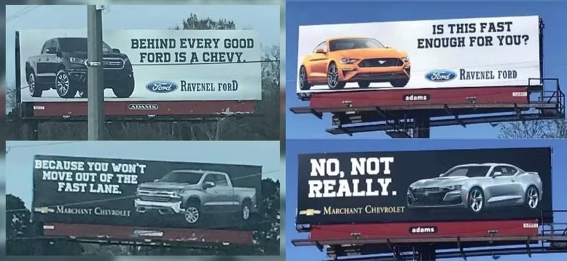
This Ford vs. Chevy billboard battle is a prime example of competitive advertising done with wit and just the right amount of playful jabs. The four-billboard back-and-forth between Ravenel Ford and Marchant Chevrolet in South Carolina turned a longstanding national rivalry into a localized marketing spectacle, grabbing attention both on the highway and online.
Billboard Sequence and Message Strategy
- Ravenel Ford:
The initial jab of “Behind every good Ford is a Chevy” features a Ford pickup and implies Ford leads the way while acknowledging Chevrolet’s presence in its rearview. The ad leverages Ford’s dominance in the truck market and challenges Chevy to respond. - Marchant Chevrolet:
Chevy’s comeback of “Because you won’t move out of the fast lane” fires back with humor, positioning Chevy as the true performance vehicle stuck behind a slower Ford. It flips the narrative, painting Ford as a roadblock, not a leader. - Ravenel Ford:
Doubling down, Ravenel answers with a Mustang billboard reading “Is this fast enough for you?” shifting the conversation from trucks to muscle cars. This strategic pivot aims to reclaim speed as a Ford strength, not just utility. - Marchant Chevrolet:
The final blow of “No, not really” accompanied by a Camaro, delivers the mic-drop moment. It asserts Chevy’s dominance in the muscle car segment, subtly mocking the Mustang’s attempt to challenge it.
The campaign targeted loyal truck and muscle car buyers in a truck-heavy market like South Carolina, brand loyalists who enjoy the Ford vs. Chevy rivalry, and locals who appreciated the regional humor. It also reached a broader digital audience through social media as the billboards quickly went viral.
The value proposition was rooted in brand confidence, with both dealerships using bold, playful claims to reinforce their vehicles’ appeal. The campaign added personality to the local dealerships, generated community engagement, and entertained audiences while promoting their inventory. By turning a competitive rivalry into a light-hearted dialogue, they showed that advertising can be both effective and fun.
Although the campaign was print-based, its success could be measured through increased dealership foot traffic, organic social media shares, and media coverage. Brand recall and positive sentiment were also indicators, particularly if customers walked away associating the brands with wit and competitiveness.
This billboard war didn’t just advertise cars, it told a story that resonated across state lines. It reminded everyone that with the right message, even a static medium like a billboard can go the distance.
References
De Kock, M. (2022, May 19). 12 Funniest And Most Creative Car Advertisements Ever. Retrieved from Hotcars: https://www.hotcars.com/funniest-car-advertisements-ever/
These five billboard campaigns demonstrate the powerful impact of out-of-home advertising when executed with creativity, cultural relevance, and a clear message.
Decathlon’s “Outage? Get Outside” turned a moment of digital frustration into a clever call to action. By mimicking Microsoft’s infamous error screen, the ad humorously encouraged people to step away from screens and explore the outdoors by offering up to 50% off gear and an easy QR scan to shop. The Mean Girls musical campaign used nostalgia and location-based wit to capture attention. With its lipstick-scrawled line, “Look Both Ways, Regina,” featured on LA buses, the campaign tapped into a culturally iconic moment while maximizing visibility in a commuter-heavy city. Dove’s “When Did 10 Stop Looking Like 10?” challenged a troubling trend by juxtaposing childhood joy with adult skincare routines. The emotional contrast made a strong societal statement and reinforced Dove’s longstanding advocacy for age-appropriate beauty standards and self-esteem. LiveOn NY’s striking twist on the iconic “I ♥ NY” logo by removing the heart created an arresting visual metaphor to spotlight New York’s urgent need for organ donors. In just a few words and symbols, the campaign made a powerful emotional and civic appeal. The Ford vs. Chevy billboard battle in South Carolina leaned into friendly brand rivalry to entertain and engage. With clever back-and-forth digs between dealerships, the campaign showcased the art of storytelling through outdoor media, sparking both local and online buzz.
Together, these campaigns prove that with the right message, even a few words on a static surface can spark action, start conversations, challenge norms, and leave a lasting impression.

Leave a comment